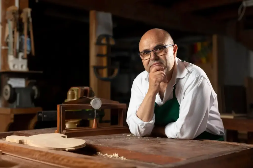
Paper Clues to the Cabinetmaker’s Story
Today we explore identifying paper labels and trade cards on nineteenth-century furniture, revealing how modest scraps of printed paper can connect a chest, chair, or table to specific workshops, retailers, and journeys. You will learn where these fragments usually survive, how paper, ink, adhesives, and typography date them, and how to protect fragile evidence while separating genuine period pieces from later additions or forgeries. Along the way, practical checklists and memorable anecdotes will build your confidence to read the signals hiding in corners, undersides, and dusty backboards.
Where the Past Sticks: Finding Surviving Labels
Locating labels and trade cards starts with understanding cabinetmaking habits and household wear. Craftspeople and retailers placed paper where it would be discreet yet accessible: drawer sides, backboards, dust panels, seat rails, and underside aprons. Time, friction, and cleaning removed many, but remnants persist as adhesive halos, ghosted outlines, or tacked corners. Bring a flashlight, patience, and cotton gloves. Think like a maker who wanted branding to travel with the object without marring its presentation or interrupting daily use.
Hidden Habitats on Case Pieces
Examine drawer bottoms near the front, the backboards behind mirrors or bookcases, and the underside of dust panels on chests. Labels often sit just out of sight, where hands rarely rub. Tilt the piece gently and use raking light to reveal discoloration, old paste smears, or torn paper fibers embedded in grain. Behind removable backs of clocks or secret compartments, fragments can survive surprisingly intact, protected from soot, sunlight, and curious fingers for generations.

Clues Beneath Seating and Upholstery
For chairs and sofas, look underneath the seat rails, inside corner blocks, and on webbing or hessian where an upholsterer might have affixed a card. Many cards celebrated new springs or patented stuffing. Lift dust covers carefully only when preservation-safe, documenting every staple or tack you disturb. Older tacks with irregular heads and wrought shanks can corroborate age. If you find only a glue shadow, measure and sketch its outline; dimensions and placement may match known examples from specific shops.


Ink, Type, and Press: Dating by Design
Typography and printing methods offer powerful dating clues. Letterpress impressions can leave a slight bite or kiss, with ink distributed more heavily on the edges of type. Steel- or copper-plate engraving produces fine, incised lines and plate marks, while lithography spreads widely by the 1830s and enables elaborate borders, shaded fonts, and pictorial vignettes. Track stylistic shifts: high-contrast Didone faces flourish early, slab-serif Clarendon styles gain popularity mid-century, and ornamented display types celebrate fairs, patents, and retail bravado.
From Elegant Contrast to Robust Slabs
Compare the sharp vertical stress of Didone family types, fashionable in early nineteenth-century advertising, with the sturdier mass of slab-serif faces like Clarendon that arrive mid-century to command attention. Ornamented display capitals, drop shadows, and shaded outlines often point to later decades. Mismatched period forms can reveal reprinted labels or modern pastiche. Look closely at punctuation, numerals, and ligatures, because those small details frequently anchor a date window more reliably than a single exuberant headline ever could.
Letterpress Signals and Inky Truths
Under magnification, letterpress typically shows slight edge-darkening where ink gathers near type shoulders. Paper compression around bold words may form a subtle relief. Oxidized iron-gall inks can brown and sometimes halo. Poor inking yields broken serifs; over-inking fills counters. Register errors create faint shadows. These tactile and visual behaviors differ from modern digital reproductions, which often sit flat and uniformly dark. Cross-validate with period spelling, numeration styles, and printer’s ornaments that recur in documented catalogues from known regional presses.
Brush Strokes, Halos, and Edges

Raking light often reveals sweeping arcs where a paste brush deposited adhesive, drying into slightly glossy ribbons. Capillary action can pull stains beyond the paper edge, forming haloes consistent with slow, aqueous glues rather than fast-setting synthetics. Edges that gently feather into surrounding patina feel persuasive. Conversely, sharp glue squeeze-out, pooled blobs, or uniform modern spray residues raise flags. Map these patterns before cleaning, because dry residues and dust lines can be as probative as the printed words themselves.
Pins, Tacks, and the Telltale Modern Staple

Small iron tacks and hand-cut pins appear on some early labels, securing corners while pastes set. Irregular shanks and off-round heads betray age. By contrast, bright steel staples are characteristically twentieth century, often accompanying replacement dust covers or recent repairs. If you find staple scars around an allegedly early card, reassess provenance. Remember to consider mixed histories: an original label might have been re-fixed with later fasteners during an upholstery job decades after manufacture, preserving truth while complicating the timeline.
Sunlight, Smoke, and Household Life

Uneven fading, smoke staining from coal or fireplaces, and hand oils around drawer pulls create gradients that can synchronize with label wear. A label hidden by a mirror backboard should not be sun-bleached; one on a desk lid might be. Soot tends to settle horizontally on ledges, leaving readable edges. Cleaning swirls can cut through grime in arcs. These environmental signatures, while imperfect, help test whether a card’s condition makes sense for its purported position and everyday use.
Names, Networks, and Commerce in Wood and Paper
Trade cards and labels map the web of cabinetmakers, upholsterers, retailers, and warehousemen who moved furniture from bench to parlour. Addresses change with partnerships, street renumbering, and expansion. Royal warrants, prize medals, and exhibition claims broadcast credibility, especially after 1851 and 1862. Terminology like “successor to,” “late of,” or “removed from” can date transitions. Read these announcements alongside city directories, period newspapers, and surviving catalogues to place a piece within the bustling marketplace that shaped its journey.
Consistency Across Object and Evidence
Ask whether the label’s story matches the object’s wood species, construction, and region. A London retailer’s card on a rural American chair could be plausible via export or resale, but it must align with hardware, screws, and stylistic vocabulary. Incoherent fasteners or freshly scraped wood beneath an aged label call for caution. Build timelines that incorporate upholstery histories, repairs, and family anecdotes. Consistency does not require perfection; it requires a pattern where independent clues agree more often than they contradict.
Magnification, UV, and Gentle Light
A 10x loupe, raking light, and UV illumination can reveal fiber length, surface compression, and fluorescence differences. Rag papers usually glow less than modern, brightened sheets. Lithographic textures differ from offset dots. UV can expose later retouching or inconsistent adhesives. Use these tools as guides rather than verdicts, and always record settings and angles. By standardizing your lighting and magnification habits, you build comparable images that colleagues and future you can evaluate without guessing how conditions skewed appearances.
Preservation, Documentation, and Community
Once discovered, labels deserve thoughtful care. Avoid aggressive cleaning, solvents, or tape. Stabilize loose corners with conservation-grade methods only when trained, or consult a paper conservator. Catalog with meticulous photographs, measurements, and placement diagrams. Share findings with colleagues to refine dates and translations. Building a collaborative archive of labels and trade cards benefits everyone, helping future owners, scholars, and restorers recognize patterns and protect these vulnerable witnesses to workmanship, marketing, and the rhythms of nineteenth-century trade.